Executive Search Platform:
Unified Hub for Research
Built a unified platform that brought scattered tools and data into one place. Strong adoption led to one of the largest expansion deals in Findem's history, establishing ESP as a leading solution.
Building a centralized hub
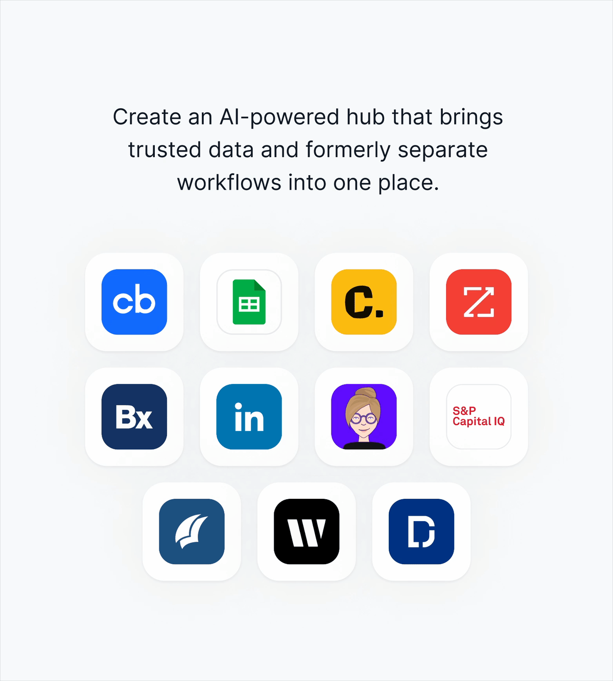
Executive Search Platform (ESP) brings AI-powered search, people data, and market insights into one place. Researchers can find who they're looking for without jumping between tools or dealing with outdated spreadsheets.
Leading end-to-end product design
I led end-to-end product design from scratch, building the platform from early concepts through launch and continuing to drive improvements. Working closely with Product, Engineering, and Consultants, we maintained strong relationships with co-innovation partners to evolve the experience.
From co-innovation
to the leading solution
In 2024, we started co-innovating with one of the world's leading global executive search firms to reimagine how their teams find and assess talent.
In 2025, we launched Executive Search Platform to 1,000+ users globally. Adoption was strong and immediate. Users exceeded their first-year usage minimums in just three months. This success led to significant expansion deals.
The platform contributed to a 59% reduction in time to source, expanded to additional firms, and became one of Findem's top solutions.
Learn more:🔗 Reimagine the next generation of executive search
🔗 How Findem is elevating executive searchWhy we started
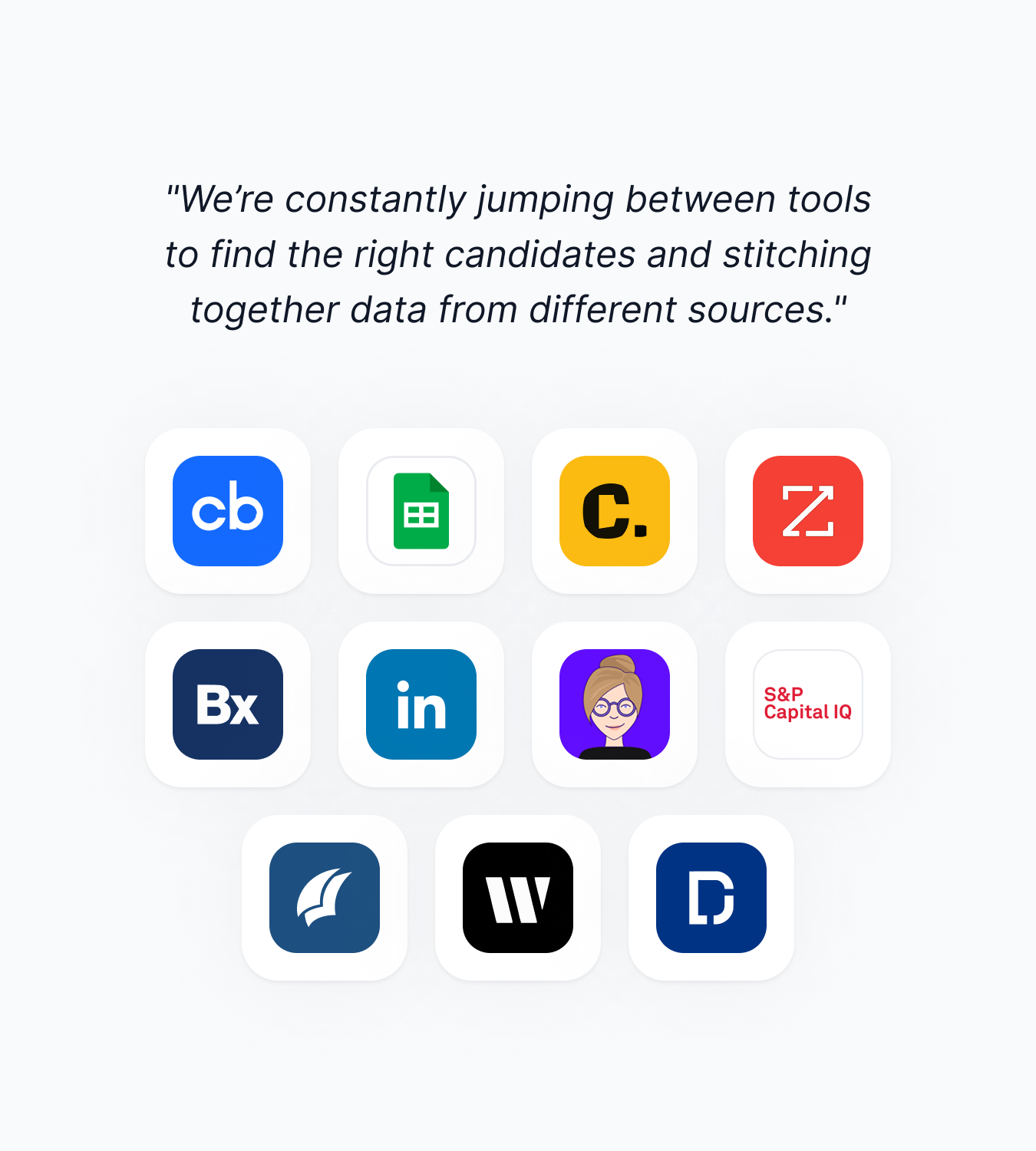
When we began co-innovating, we found researchers faced fragmented workflows. Without a central hub, they were navigating over 10 tools and data sources for every search. The work was slow and impossible to scale.
User challenge
Researchers relied on multiple disconnected tools and data sources. Constantly switching between tools made the process inefficient and time-consuming.
They manually tracked everything in spreadsheets, where data quickly became outdated. And because every deliverable was built from scratch, the work didn't compound. Each new search started over from zero.
Business challenge
Speed is crucial. When teams can't deliver results quickly, they risk losing clients who expect fast, accurate work.
Goal
Build a centralized hub that unifies workflows and helps teams deliver faster.
Design goal
Create a platform that integrates trusted data and unifies workflows, so users can find what they need in one place without constantly switching between tools.
Business goal
Speed up the process so users can deliver results quickly, giving them more time for strategic work and improving client satisfaction.
Who we’re solving for
Our primary users are executive search researchers. Their job spans the full search lifecycle: defining what a great candidate looks like, mapping the market, building and refining candidate lists, and producing deliverables for clients.
Before ESP, that work was spread across over 10 disconnected tools and data sources. Researchers were constantly context-switching, manually tracking progress in spreadsheets, and rebuilding context from scratch for every new search. Nothing carried forward.
What we heard
"I'm constantly jumping between platforms to find candidates and gather market data. It's slow and frustrating."
"I use spreadsheets to build candidate lists. It's all manual, and by the time I share it with my consultant, half the data is already outdated."
Design approach
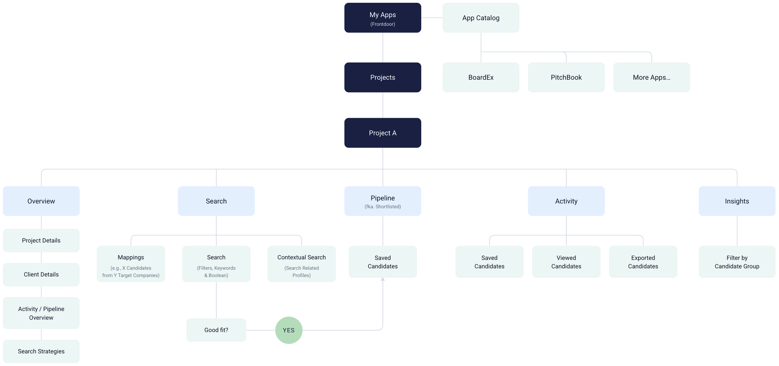
Information architecture: organizing workflows in one platform
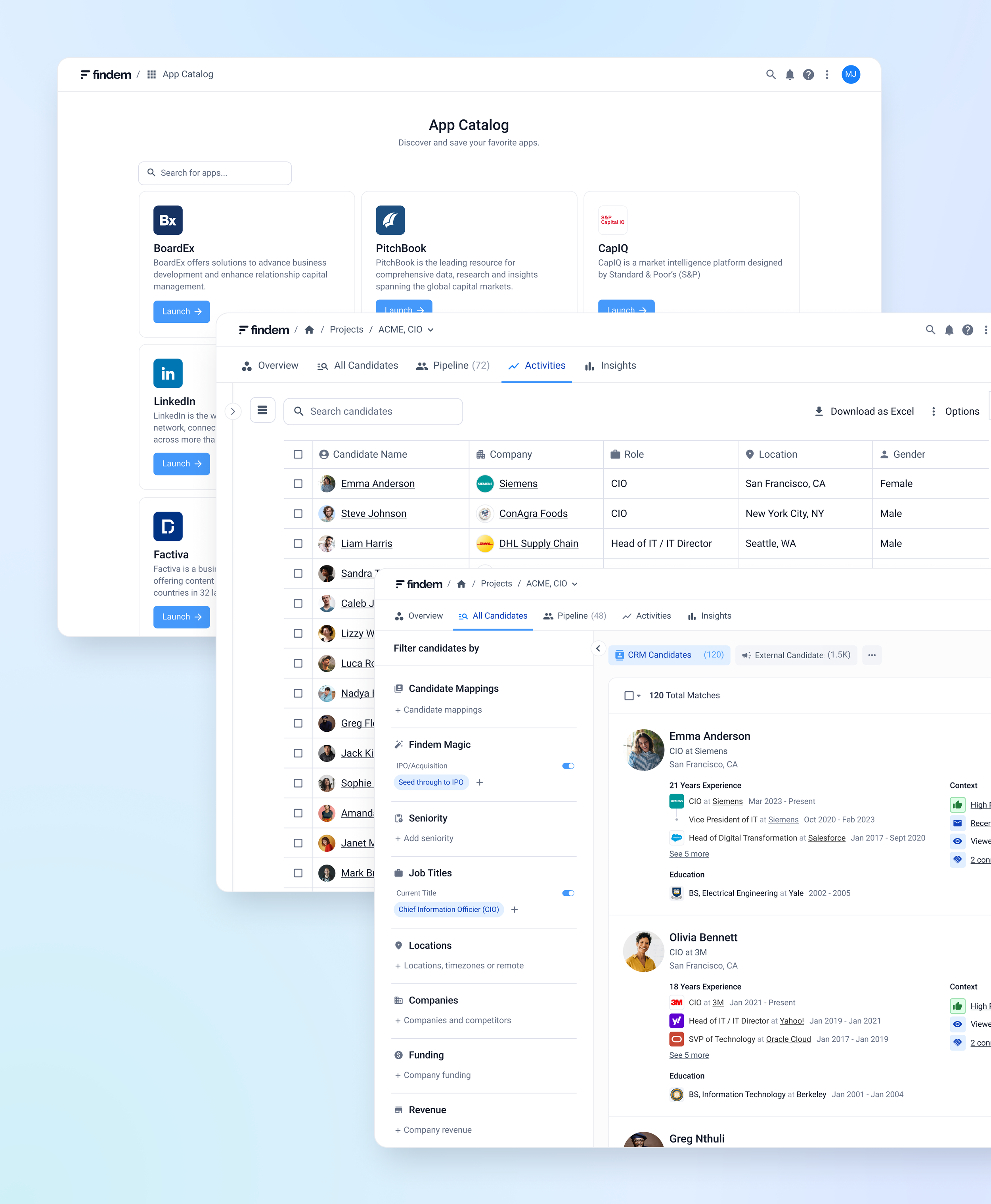
We started by designing My Apps and the App Catalog, giving users control over which tools they want to access most frequently.
We then structured the process around projects. Each project is a workspace for a specific engagement where users conduct searches, review profiles, and track progress. All the data and tools they need live inside the project, so users never have to leave or switch to another tool. Everything stays in one place.
This structure helps users stay focused without losing context or duplicating effort. The challenge wasn't just unifying the tools. It was earning enough trust that researchers would switch their primary workflow to a platform they hadn't used before.
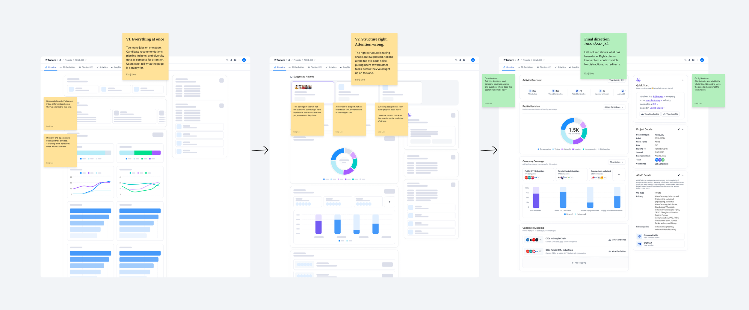
From noisy to intentional
Defining the project structure was straightforward. The harder question was what each surface inside a project should actually show. The overview page went through the most iteration before we got it right.
Early versions were noisy. One version surfaced recommendations from similar projects alongside diversity insights. Both belonged in other tabs. A later version introduced Suggested Actions, but pointing users toward unrelated tasks pulled them away from the work at hand.
The problem wasn't the individual features. It was the lack of a clear purpose for the page itself. We were adding things users asked for without asking what the overview was actually for.
The answer was simple: show researchers what they've done, and keep them aligned with their client. Everything else belonged somewhere else.
Core features
The platform spans multiple surfaces: App Homepage, Projects, Search, Pipeline, and Activities. Most were built on existing components and patterns. The decisions that shaped the experience most were in the surfaces we designed from scratch.
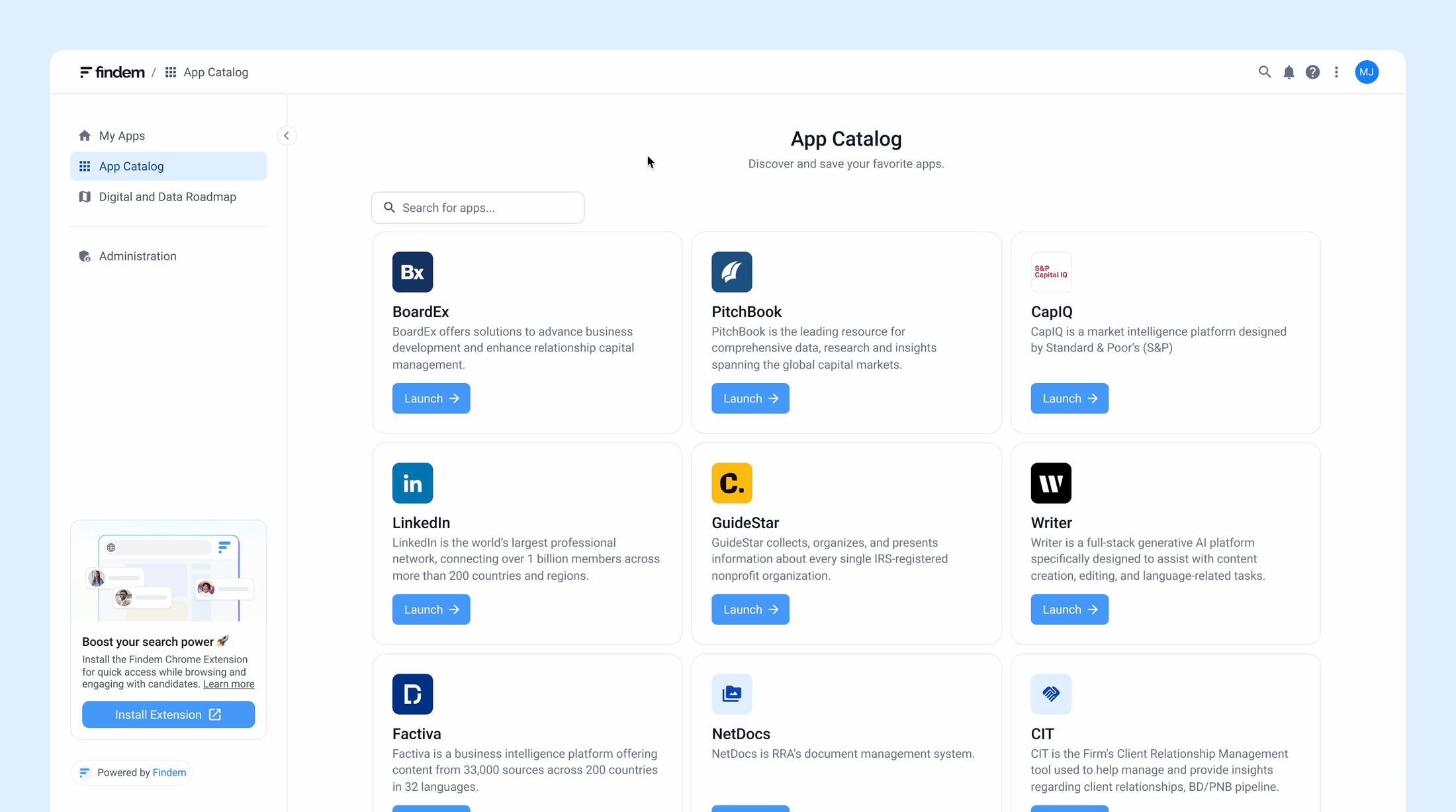
My Apps & App Catalog: control which tools to use
To reduce time spent switching between tools, we let users choose which tools they want to access most frequently. My Apps is where users access their most-used tools, and the App Catalog lets them browse and add apps to personalize their workspace.
Projects: centralized workspaces for each engagement
Each project is a workspace for a specific engagement. Everything related to that engagement happens in one place instead of being scattered across multiple tools.
Within each project, users have access to:
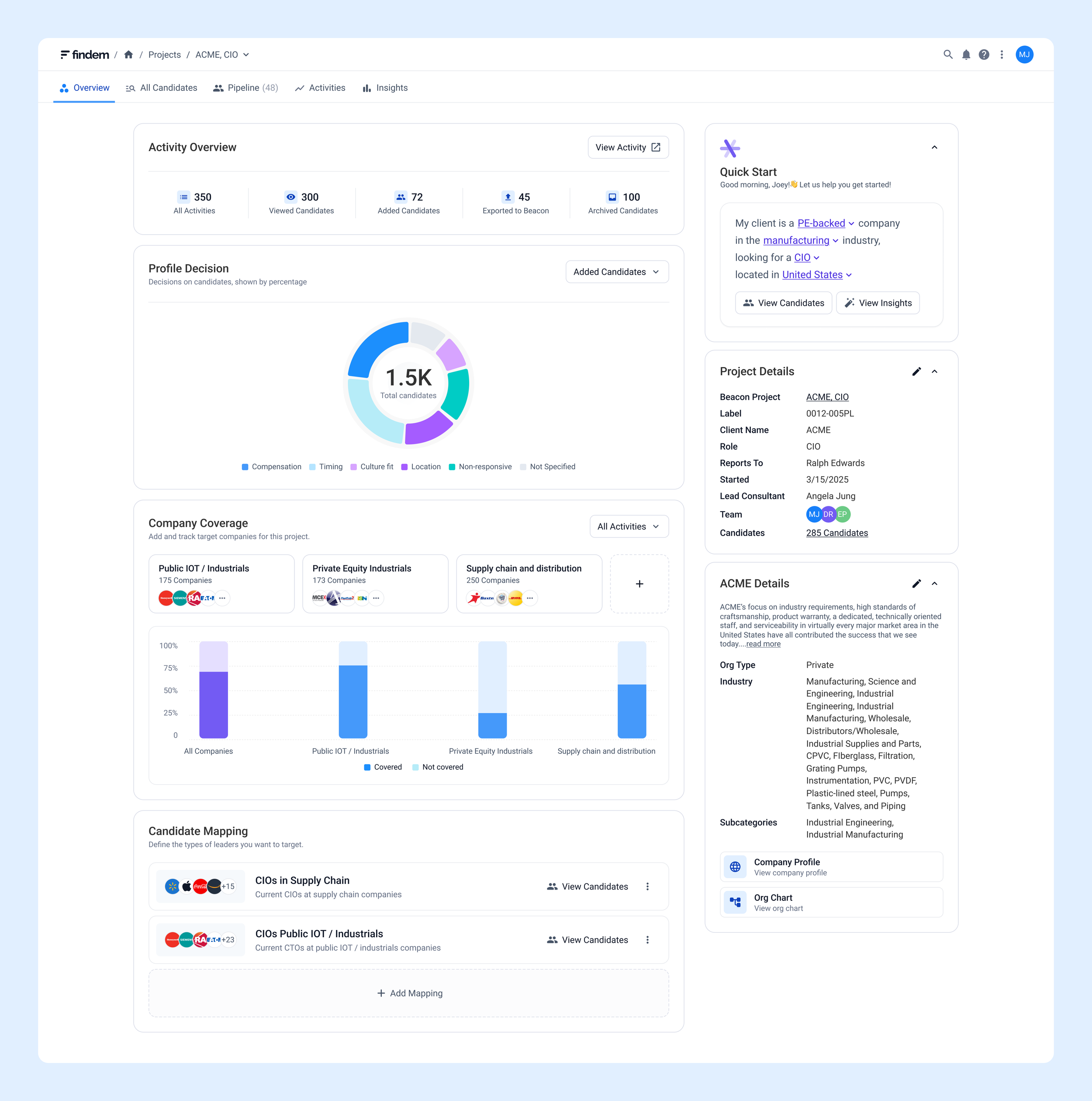
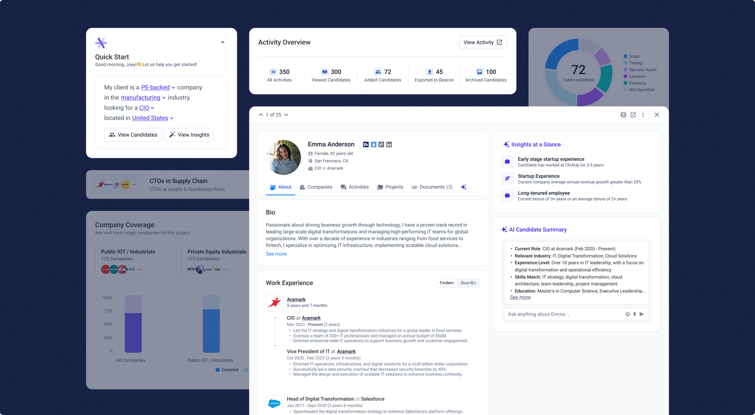
Project visibility: track progress in one place
Jumping between tools meant researchers couldn't easily see the big picture or quickly reference what the client needed. We designed the project overview to show progress at a glance.
The left side displays activity metrics.
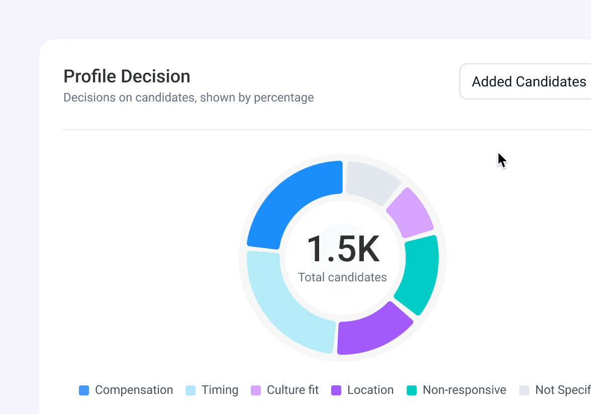
The right side keeps client information and requirements visible, so users always have key context while they work.
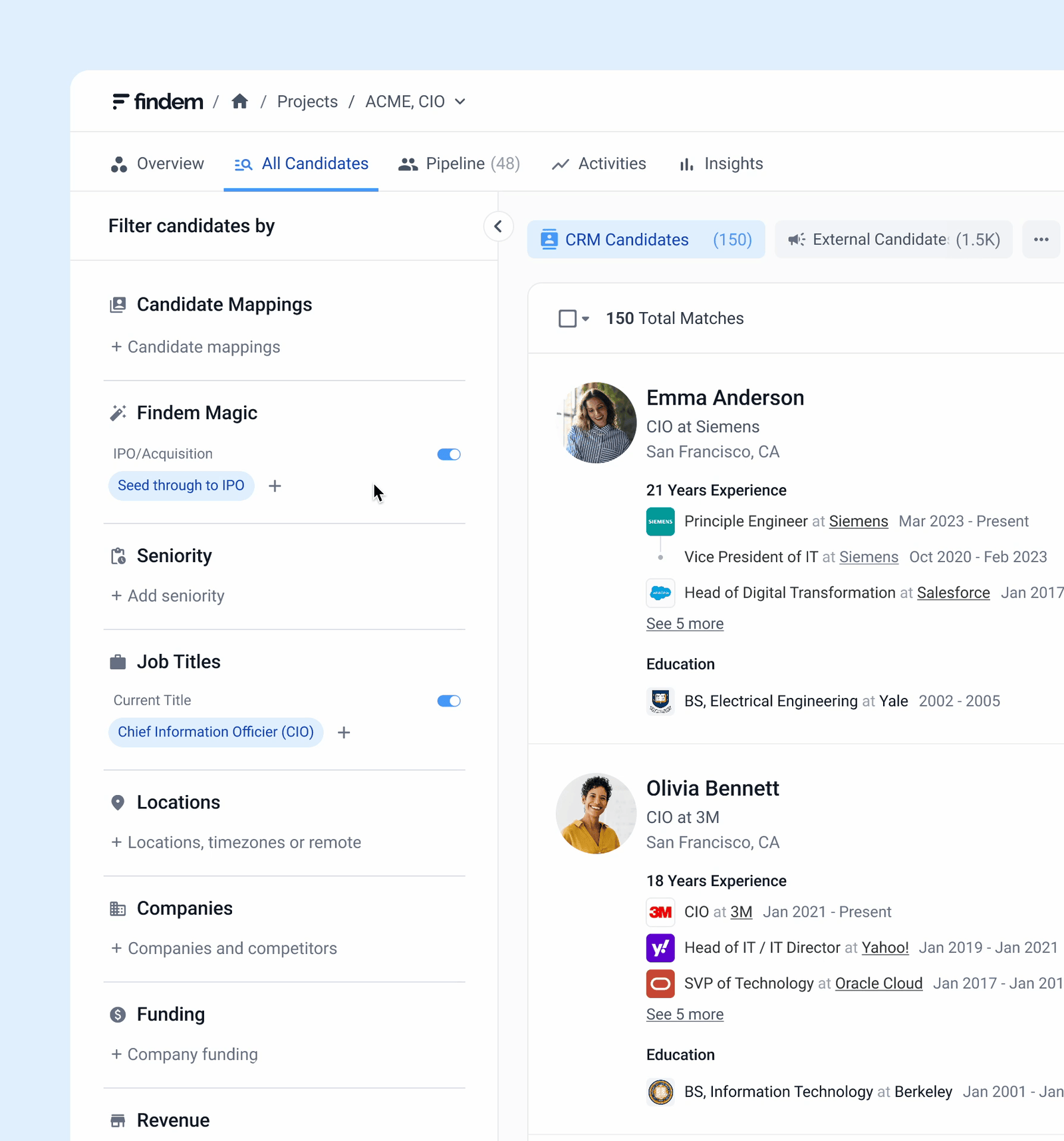
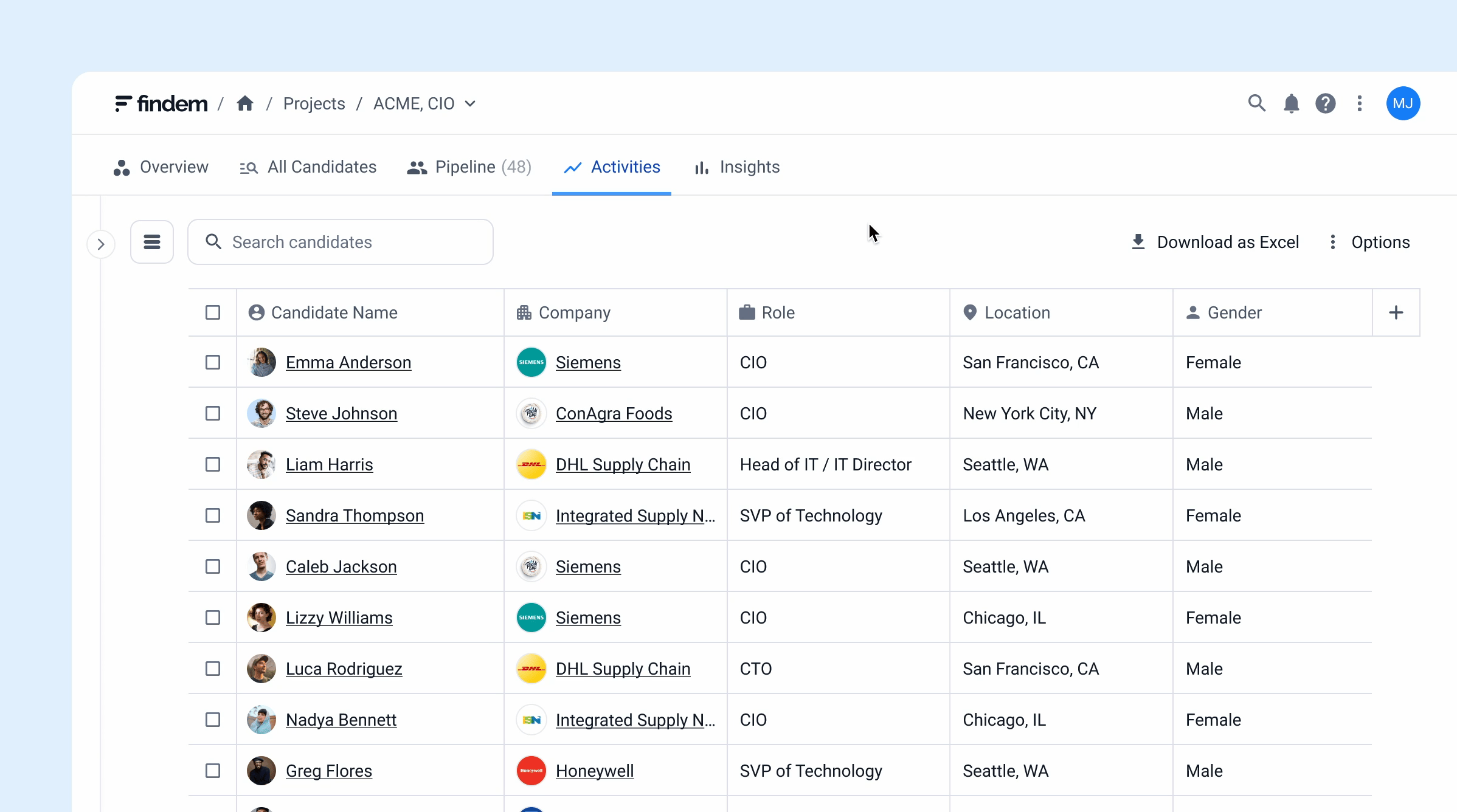
Unified search with integrated data:
find people without switching tools
Researchers relied on multiple disconnected platforms to find people and gather market data. We integrated data from sources like BoardEx, PitchBook, LinkedIn, and Crunchbase directly into the platform. Users can filter, explore rich profiles, and access market context without switching tools.
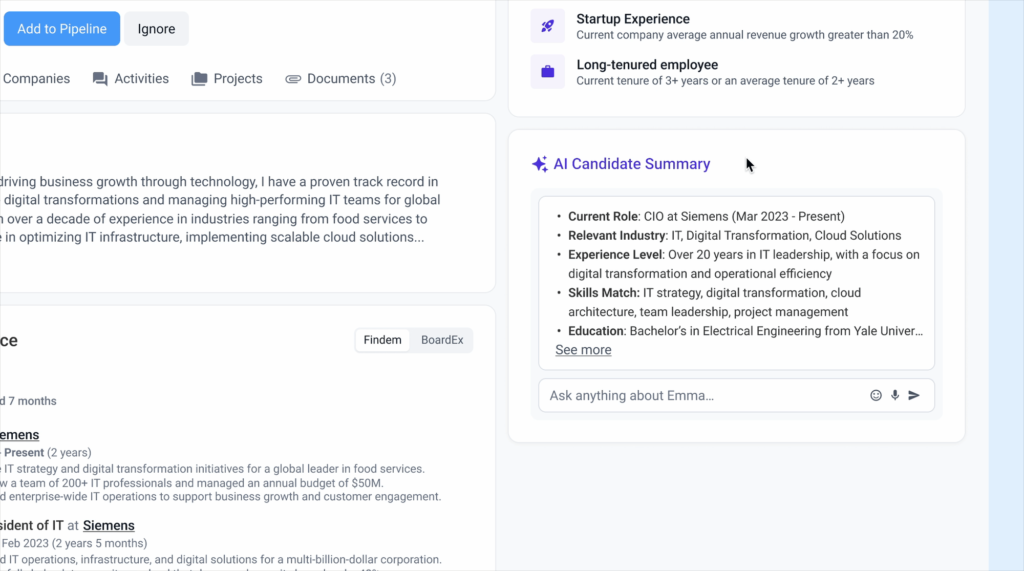
AI-powered insights: complete view faster
To help users review and validate people quickly, we combine data from multiple trusted sources into a single profile, giving users a complete view of someone's background. Users can ask AI questions or generate a summary pitch, making it easier to assess fit and communicate findings.
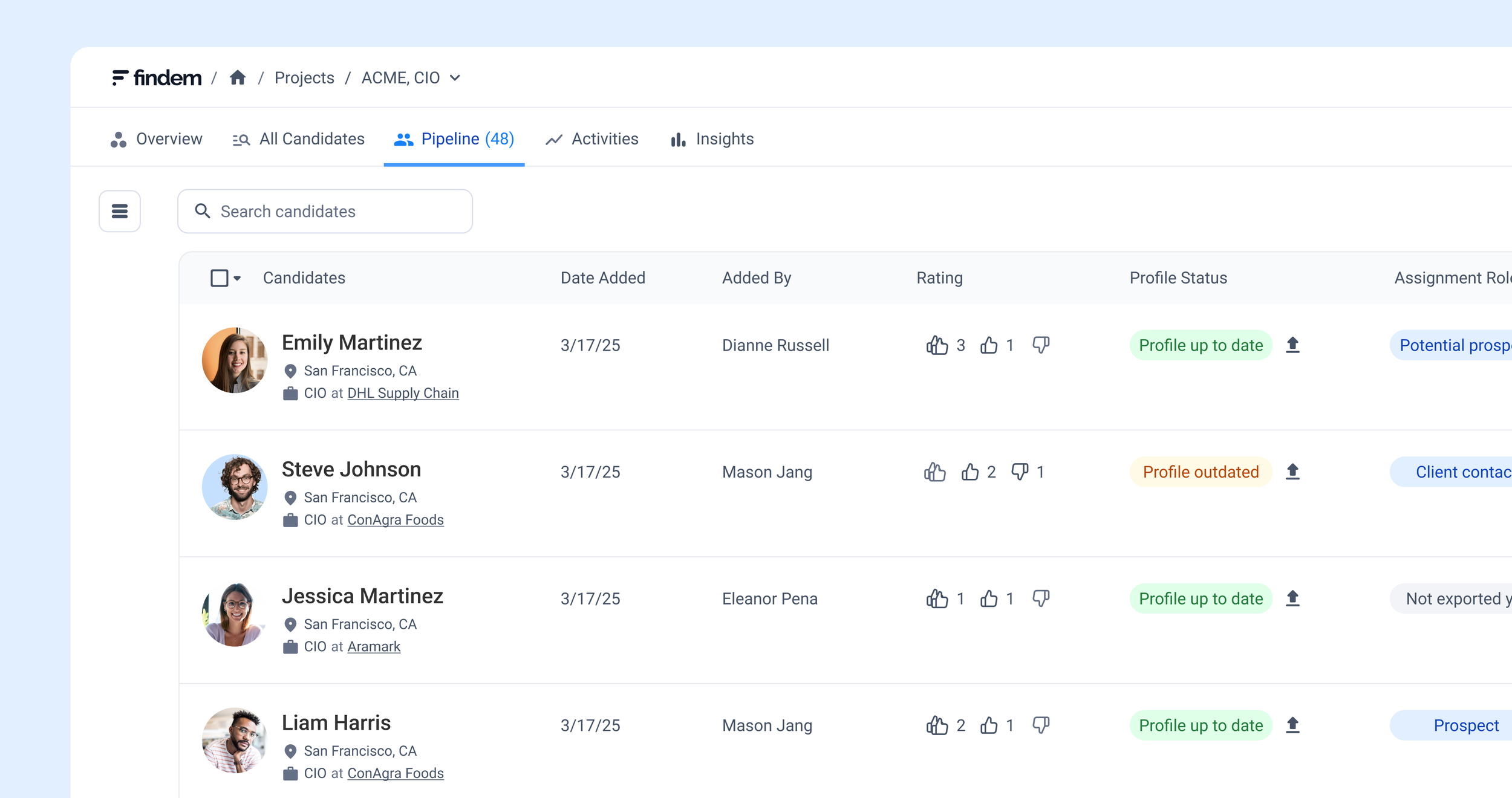
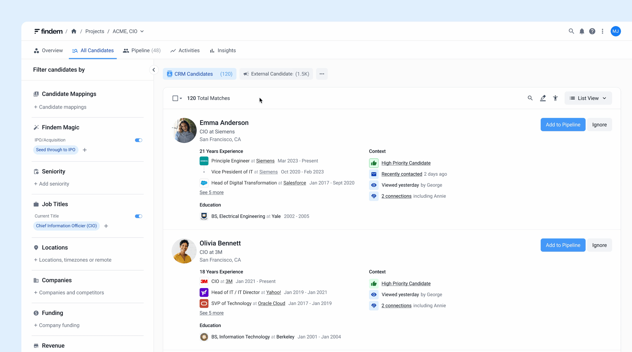
Save and track: build a pipeline within projects
Instead of manually tracking in static spreadsheets, users can save directly within their project.
Saved profiles stay in the project, and users can add reviews, comments, and export when ready.
Track and manage contacts:
keep data current automatically
Manual spreadsheets meant data quickly became outdated. We designed an interactive table that feels like a spreadsheet but stays automatically up-to-date.
Familiar Excel-like controls like filtering, reordering columns, and exporting as CSV helped users adopt it more easily.

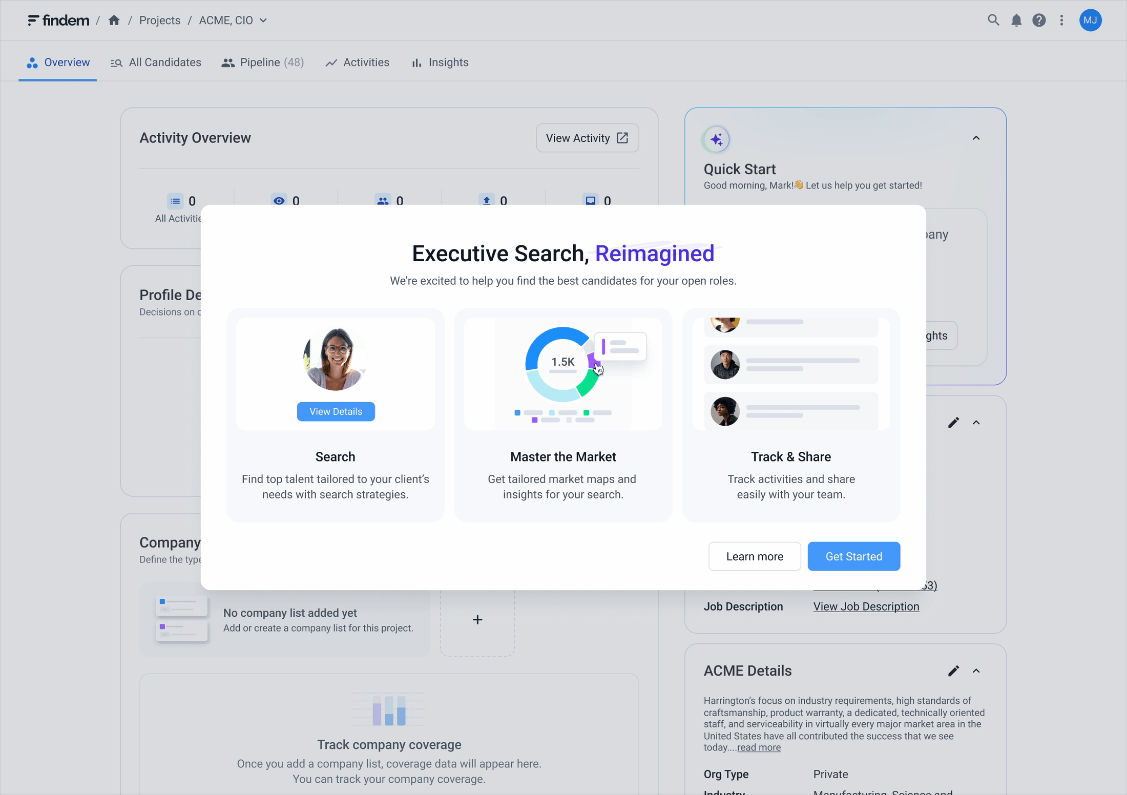
In-app education: guiding first-time users
To help first-time users onboard smoothly, we introduced in-app education at launch. New users see a greeting and step-by-step guide upon logging in, with a help center available throughout.
Results & impact
We launched to over 1,000 users globally across the US, UK, Germany, Japan, China, Australia, and beyond. Strong adoption drove one of the largest expansion deals in Findem's history, and the platform expanded to additional firms, establishing ESP as a leading solution.
59% reduction in time to source
Researchers went from juggling five or six disconnected tools to running entire searches inside a single platform.
“I'm just starting to play around with Findem, but you can really see how it will be a game changer. It is a one stop shop. You are able to search by parameters from various databases, quickly go to links, and even see board service or if a person is in custody on a search.”
– Research Director
“I think the Findem platform is great and has the potential to transform our research workflows. The enriched data that it also provides (e.g., company descriptions, CapIQ) data also take it beyond just a simple tool that aggregates information into one spot.”
– Research Consultant
Learnings & what’s next
ESP was Findem's first co-innovation project and has since become one of our flagship solutions. Working closely with our partner's researchers from discovery through launch taught me how to balance user needs with business priorities when the stakeholders on the other side have a strong voice and high expectations.
The biggest lesson wasn't about design craft. It was about knowing when to hold your ground and when to adapt. Working with a large enterprise partner meant navigating feedback that sometimes pulled toward feature requests rather than user problems. Learning to translate that tension into principled design decisions, while keeping the relationship intact, changed how I approach stakeholder work.
But the deeper realization came after launch. ESP drove strong adoption and measurable efficiency gains, and that success revealed something new. Users were faster, but the underlying work hadn't changed. Researchers were still building every deliverable from scratch. Making the platform better wasn't enough anymore. The next question was whether the product could do the work itself.